The Process of Making Album Art
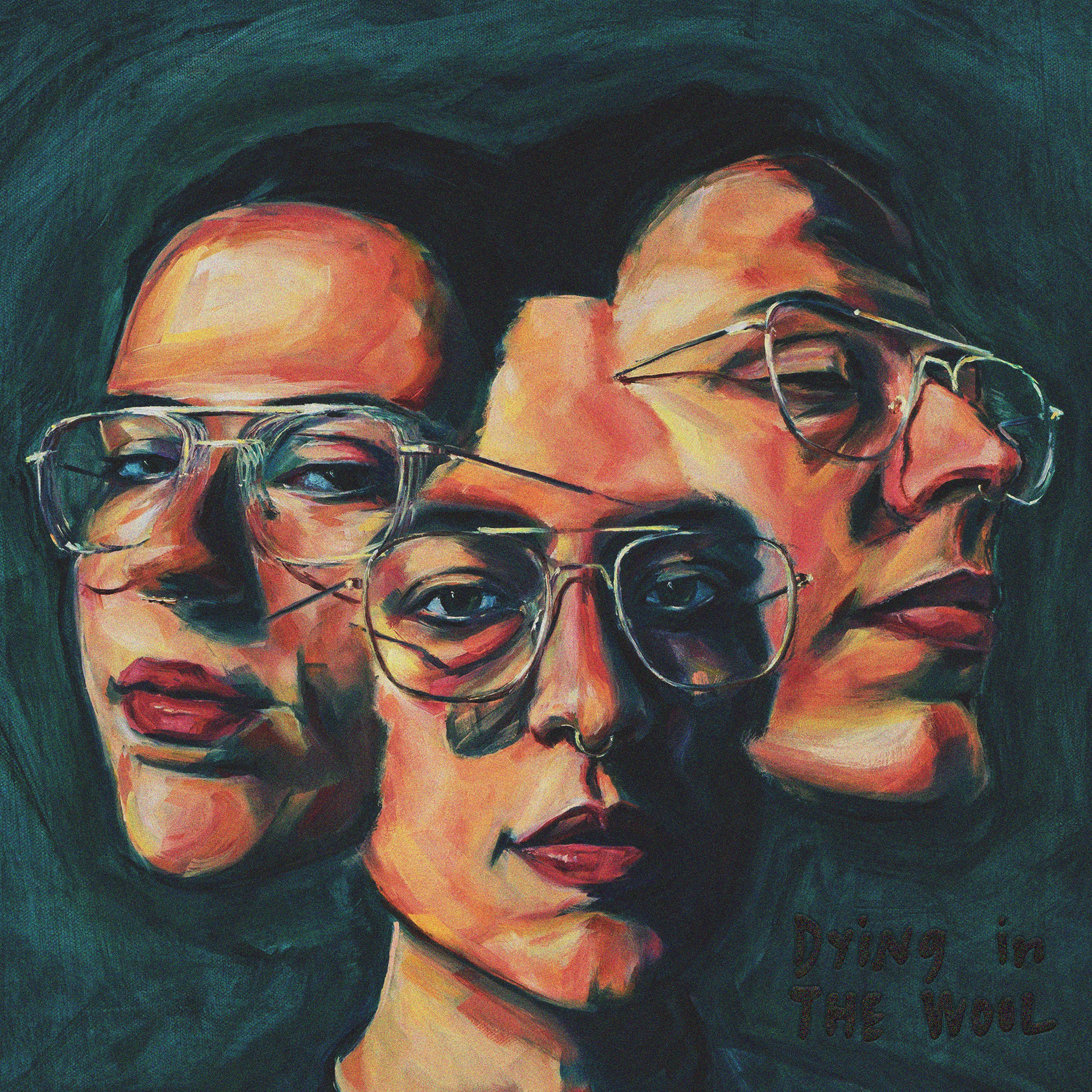
Dying in the Wool, a new EP by Claire Ozmun, is out on all streaming platforms today! I had the honor of creating cover art for this incredible record. Read on for a behind-the-scenes look at my creative process and stream Dying in the Wool!
A Little Backstory
When singer-songwriter Claire Ozmun approached me about painting cover artwork for her upcoming EP, I couldn’t have been more thrilled. Art and music are my great lifelong loves (I’m a singer-songwriter myself!), so it was a dream to collaborate on a project that married the two.
Not only that, but Claire is an incredible musician and person! I met her through a meetup following a School of Song songwriting workshop taught by Robin Pecknold in 2022. I rushed home and listened to Claire’s WIP songs uploaded to the class’ online portal and was immediately taken with her writing and voice. I knew then she was a huge talent and was excited to follow her journey as an artist.
Earlier this year, Claire saw an Instagram post of my artwork and sent me a message that made my whole week:
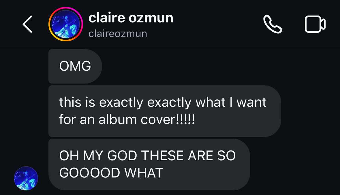
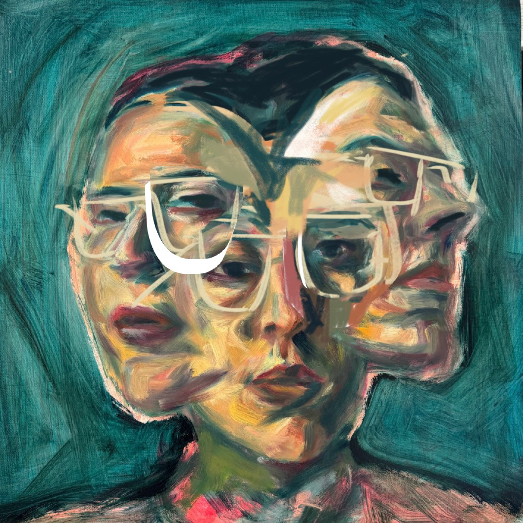
Claire wanted to commission a piece that followed the multi-face concept of my current work. Her timeline was tight but I was so incredibly game. After discussing some general vibes Claire wanted, I got to work. The month-long process of creating this piece was challenging but also so rewarding and instructive. And what better way to celebrate the EP’s release than to share a little bit of my process and what I learned along the way!
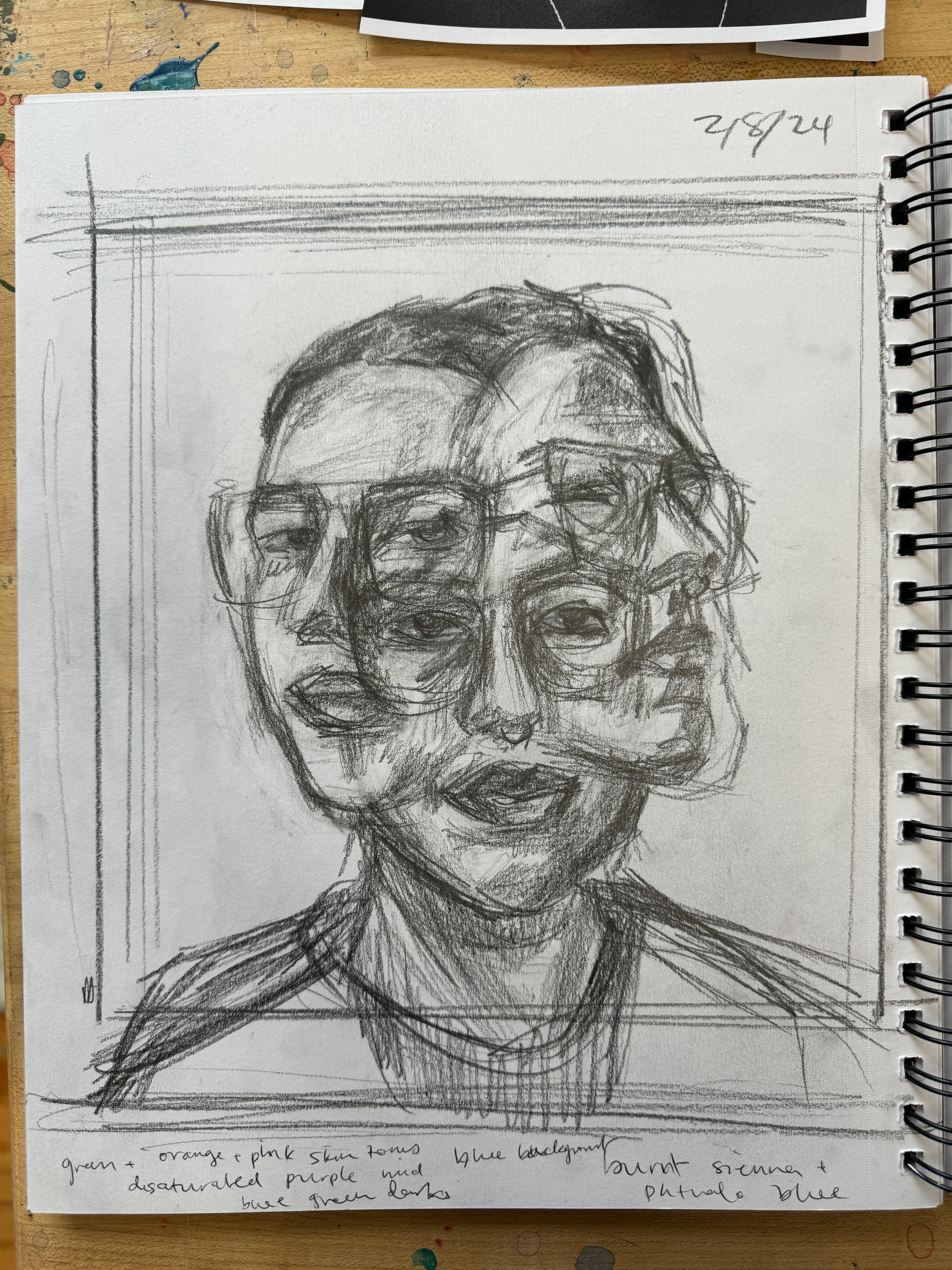
1. Sketching
This project introduced two new variables affecting the composition:
• Square instead of portrait format
• Claire wears glasses (surprisingly new territory for me!)
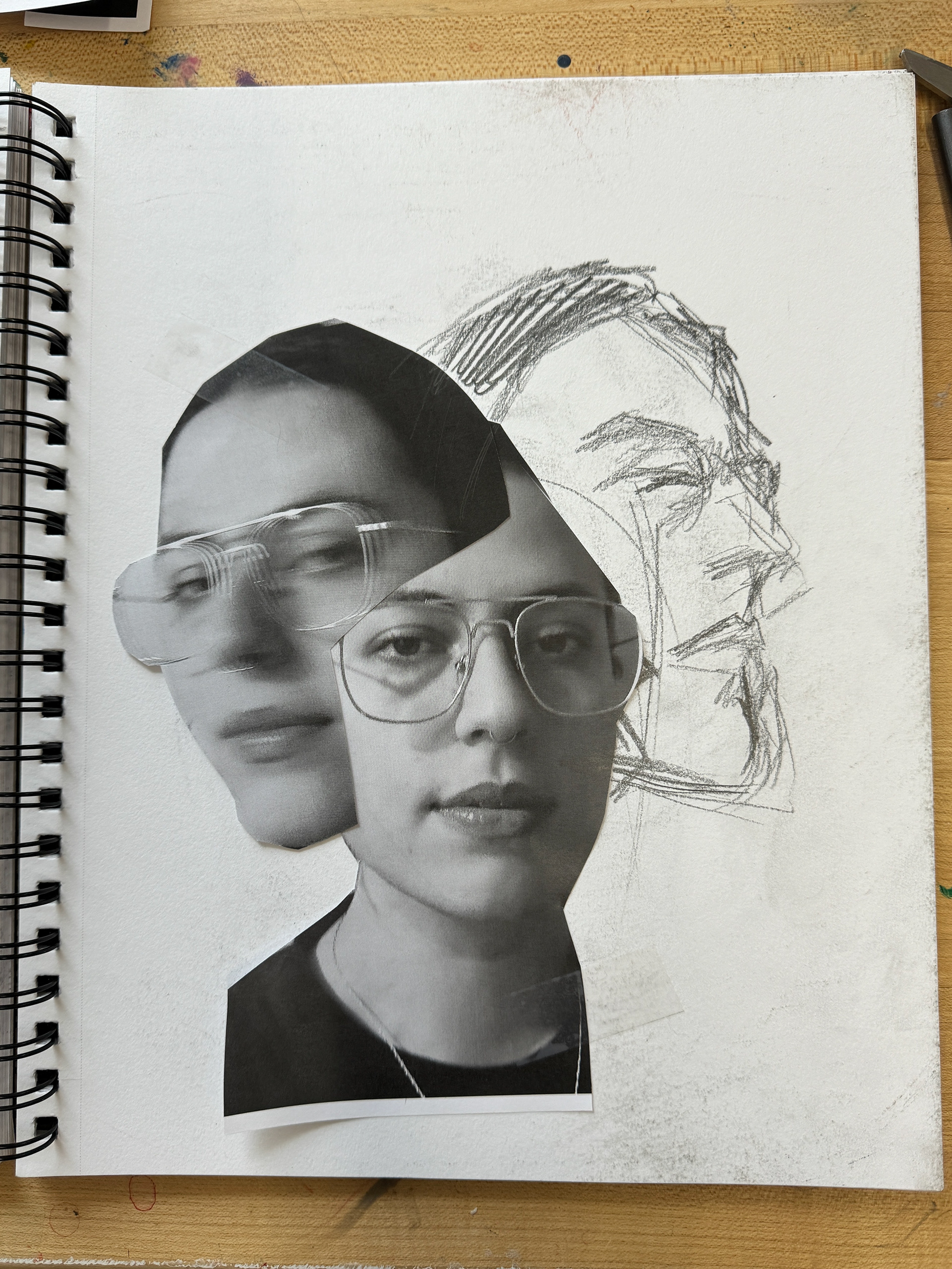
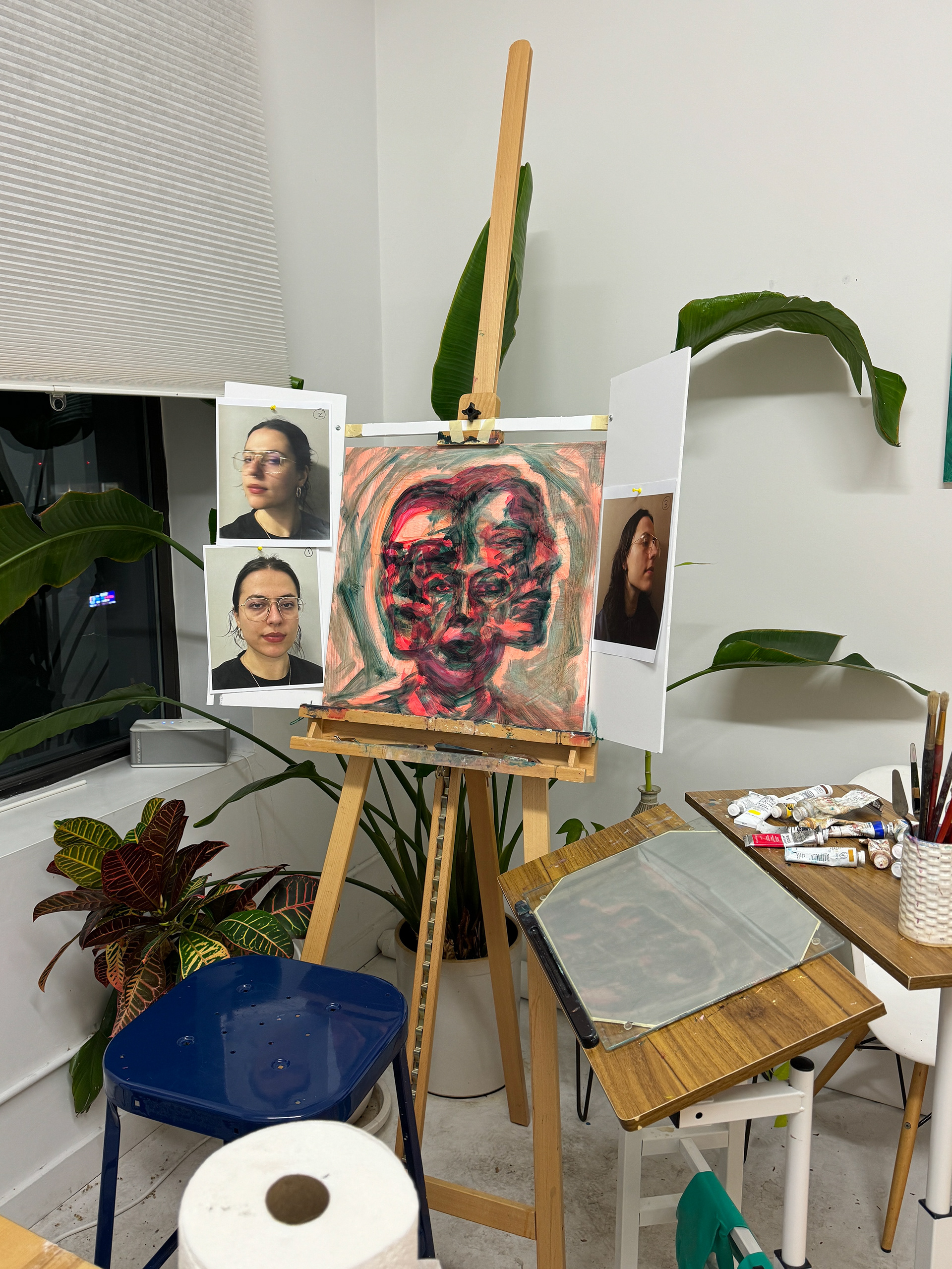
Before starting on the painting, I did my usual pencil sketching. I also tried out a new method of cutting up reference photos to arrange and rearrange different compositions.
During the painting process, I started using digital tools like Photoshop and the iPhone markup tool to draw directly on work-in-progress photos and plan out edits. These tools gave me a quick way to prototype different edits without sacrificing lots of time and paint, and I’ve continued to use them ever since.

2. Painting
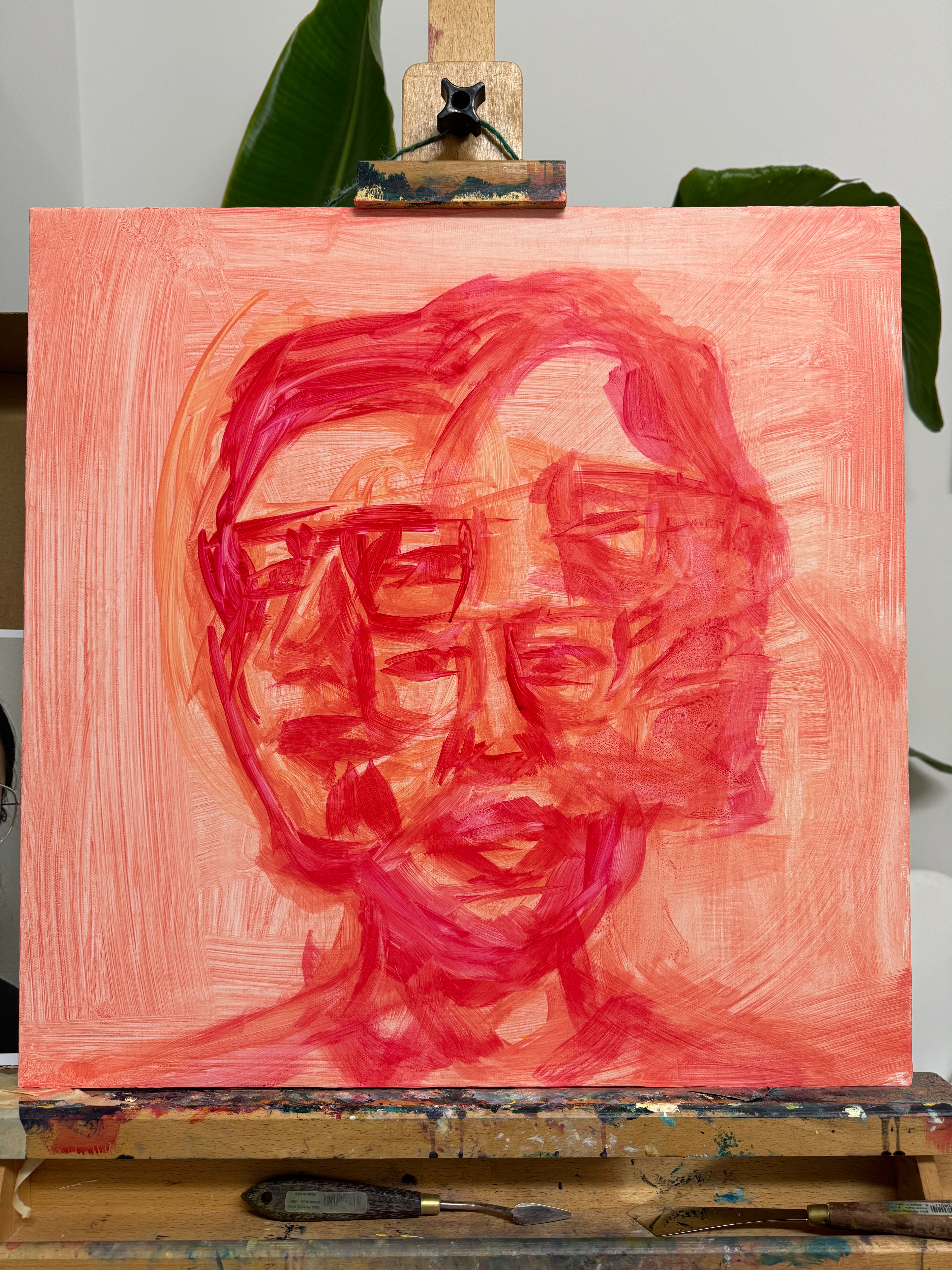
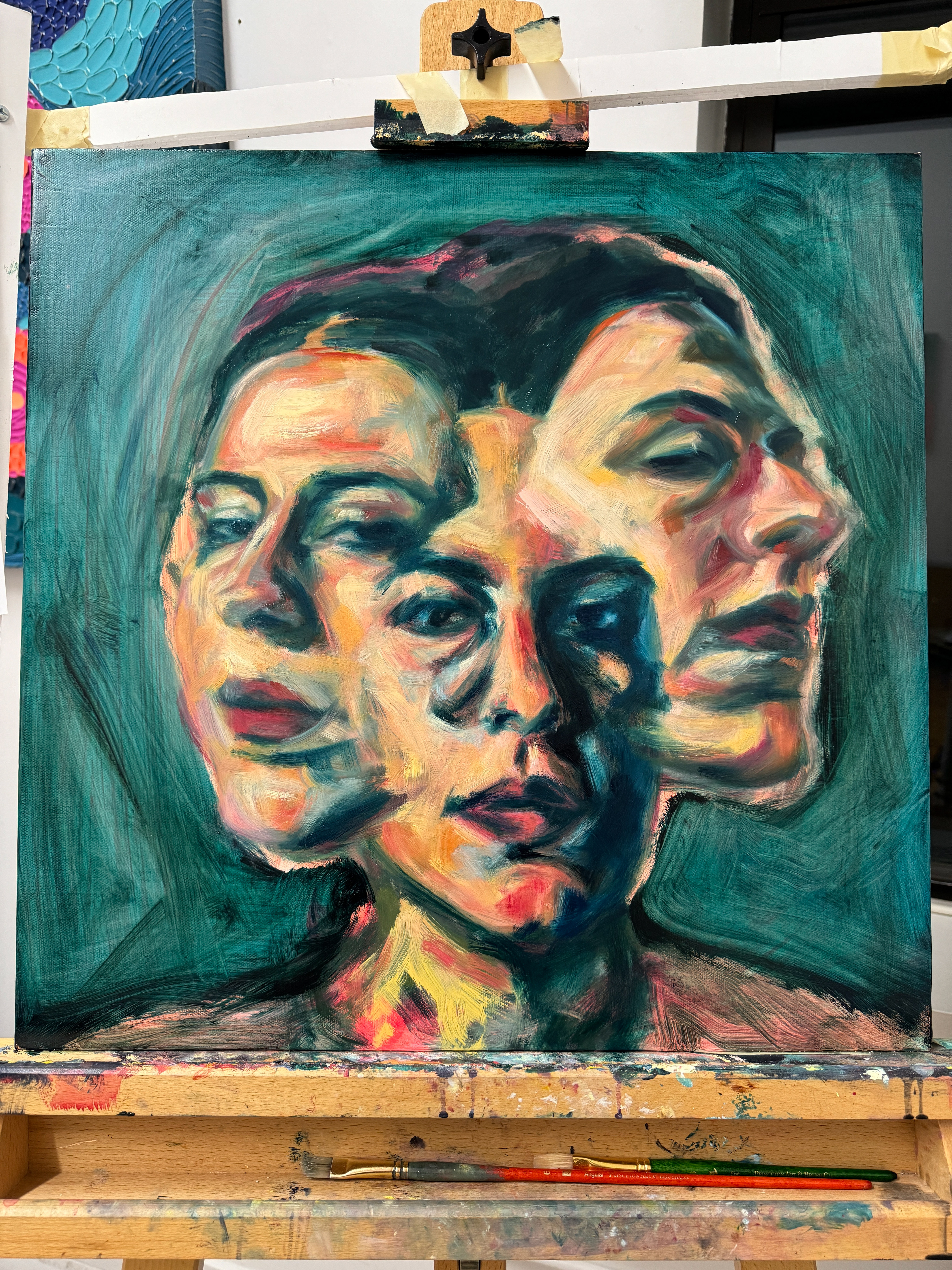
The painting process was long and arduous, with my focus being on composition and color. I started with a rough underpainting sketch in reddish-orange acrylic paint and quickly realized that I wanted the faces to span out more so they didn’t feel so constrained on a wider canvas. The color palette kept shifting as I worked — I spent a lot of time exploring warmer vs. cooler tones and the balance between the different hues.
I usually listen to music as I paint, immersing myself in sound and feeling that subconsciously makes its way into the piece. Claire was kind enough to send me an early mix of her EP to listen to as I worked, which became invaluable to my process. In each layer of paint, I tweaked the composition and color palette ever so slightly until I was left with a finished piece that felt like an authentic representation of Claire’s record.

3. Photography
Painting the piece wasn’t enough — I had to deliver a high-quality digital reproduction. I knew I couldn’t rely on my usual photography methods because the top layer of the painting was oily and still wet, a recipe for massive amounts of glare. I could edit out the glare in Photoshop, but it would be tedious and lossy. After a lot of research, I decided to try out a new technique: cross-polarization.
Cross-polarization photography uses polarizing filters to physically cut out glare. I love physics so I enjoyed reading up and understanding how it works. Here’s my simplified explanation of the science (TRIGGER WARNING: SCIENCE WORDS):
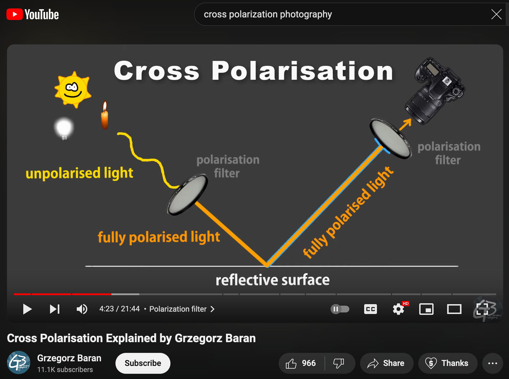
My typical photography setup includes a camera on a tripod, lamp (light source), and the painting on a wall. Normally, light from the lamp hits the painting and reflects into the camera, whose sensor captures the incoming light as an image. Some of the light from the lamp hits the painting at just the right angle to reflect straight back out into the lens. That’s specular reflection, which is what we perceive as glare. That’s what we want to filter out.
Now imagine light energy as little sinewaves moving along through space. A polarizing filter is a film that allows only lightwaves angled in one direction to pass through. I put one filter on the lamp and another filter on the camera lens, rotated 90° from the lamp filter’s angle. In this new setup, light goes through the lamp’s filter, gets polarized to one direction, reflects off the painting, and gets filtered again by the camera lens filter. Specular reflections, because they reflect directly, keep their polarization angle from the lamp filter and are cut out completely by the lens filter’s angle. All the camera sensor picks up are diffuse reflections, which is the color information of the painting.
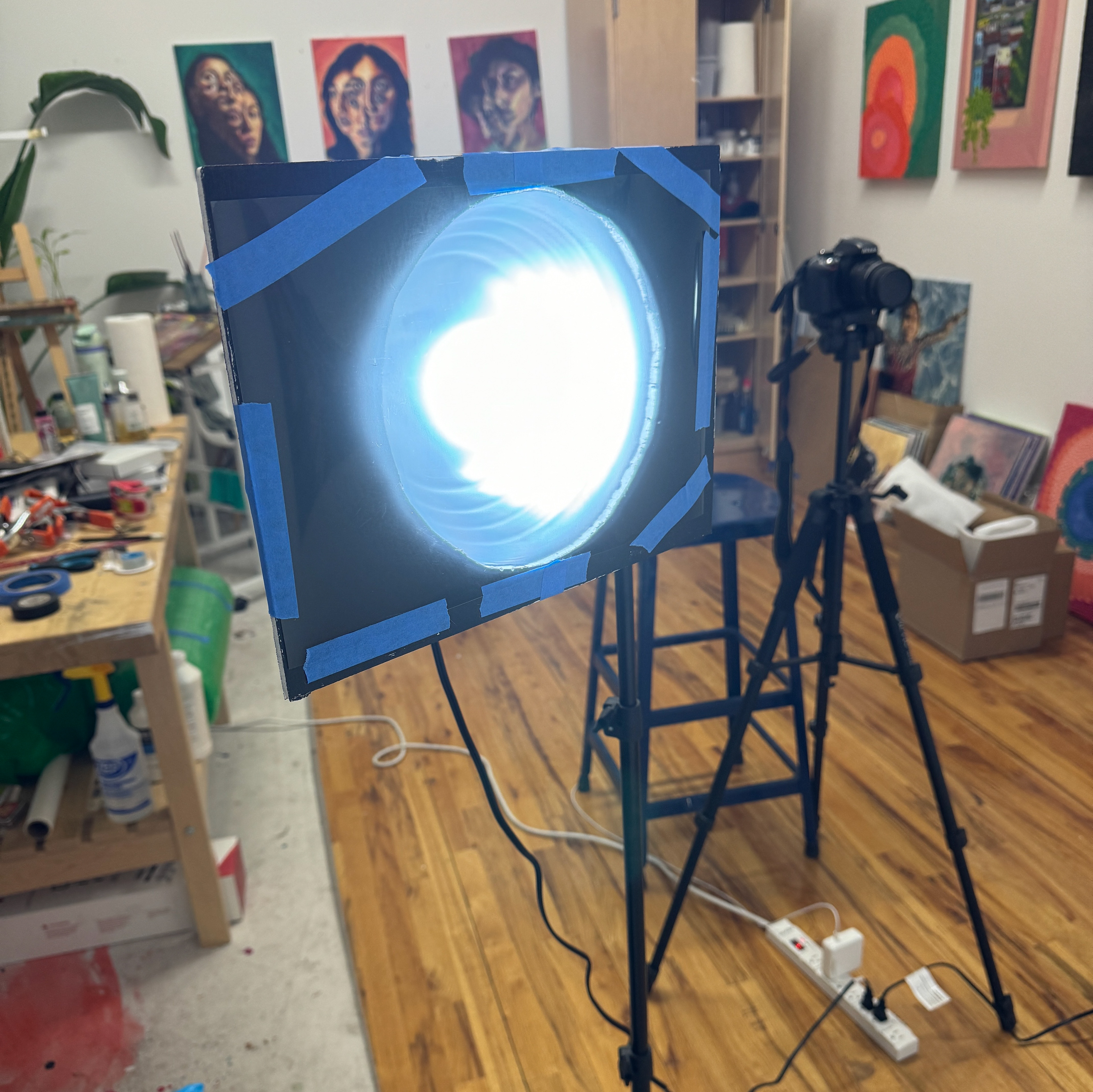
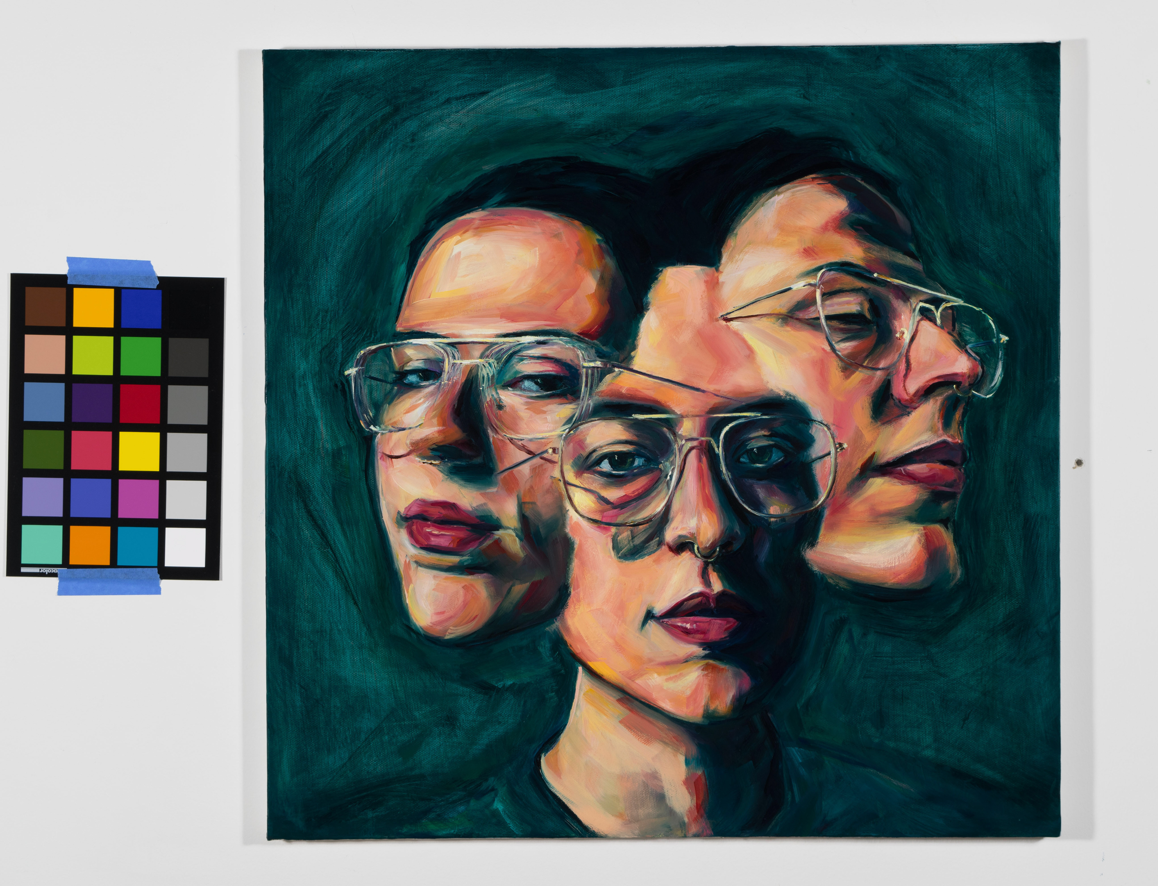
I was determined to make this setup on a budget. The first filter was made by taping polarizing film to one side of rectangular cardboard pieces painted black with circle cutouts, which I mounted onto the front of two cheap reflector lamps. My friend Pallavi generously lent me her fancy Nikon camera, to which I attached a polarizing lens filter. I was truly shocked by how good the results were from just this makeshift setup. My ColorChecker reference (the little grid of colored squares) that I use in color correction editing, showed that no correction was needed. Cross-polarization gave me basically a perfect photo right off the bat.
New Music Friday!
I sent my final image to Claire, she made a few edits, and now my piece gets to live alongside her EP out in the world. This was such a fun piece to work on and I’ll be carrying the experience with me for a long time. So grateful to Claire Ozmun and her label, Better Company Records, for including me on this project. I’m excited it’s finally here - listen to ‘Dying in the Wool’ today!